1. UAntwerp as a community
UAntwerp is an organic mix of communities united by a shared reputation and ambition. Each has its own ideas and opinions, which sometimes clash, but ultimately reinforce one another. We're a community of thinkers and doers, helping to shape the future together. Your voice matters.
We communicate as a community in order to:
- valorise and connect our diversity and variety;
- stimulate interaction;
- disseminate results;
- grow the community.
Our community takes the form of a 'branded house': each voice in the community matters, each voice is unique, but the end goal is to maximally strengthen the parent voice.
2. Who is speaking?
As each voice is important, our house style is built around one simple question: who is speaking? We recognize three speakers: the parent, the subsidiary and the sister.
2.1 The parent speaks
2.1.1. The parent voice
Here, UAntwerp speaks as an institution, addressing either the internal community (students, employees) or a broad external target audience. The parent communicates using clear language and a distinct graphic profile.
The parent voice can be seen and heard in the press, or in image-building or recruitment campaigns aimed at new students. In these cases, there are no deviations in terms of colour, layout or typography.
The parent voice is commonly used in the contexts listed below:
- Website
- Image-building campaigns
- Recruitment campaigns
- Brochures
- Open days
- The university's social media channels
- Stationery
- General newsletters and PowerPoint presentations
- Press messages
-
 Social media templates in Canva
 -
 Recruitment campaigns
 -
 Brochures
 -
 Stationary
2.1.2. The parent voice combined with colour
A parent has many duties. Sometimes her voice needs to be more nuanced. The parent is still speaking, but she is addressing a particular audience. After all, each faculty is distinct, which allows us to add certain touches in terms of text or colour to attract the right audience. This way, we can add a little nuance to our communication (using faculty colour and language).
Most communication at this level addresses prospective students (programme pages, faculty-level recruitment campaigns). They are not yet familiar with the concept of faculties, but the use of colours give us the opportunity to incorporate graphic differences that clarify our messages. The language we use is also more nuanced.
-
 Recruitment brochures for each faculty
 -
 Recruitment campaign linked to a faculty
2.1.3. The parent voice combined with graphic elements
In many cases, the parent voice addresses a well-defined target group, such as students, researchers or staff members, and the main logo suffices. Sometimes, those target groups are less defined and is the goal of the communication more important. To highlight this goal, we communicate with a graphic element.
It is the parent who speaks (100% UAntwerpen), but the voice needs a certain individuality to be quickly recognisable.
These graphic elements are not parallel to the structure of our university. Not every department or service automatically gets its own identity. When a particular group/entity has a goal that differs from the basic goal of the university, a graphic element can be added.
Some examples:
- The University Fund has a very diverse target group (from companies to individuals sympathetic to our university). Its job is to enthuse that target group to make funds available.
- When the STIP (Student Information Point) wants to reach students in need of support, its target group is distributed across all faculties. A more specific voice is needed for that task.
-
 Instagram University Fund UAntwerp
 -
 Facebook STIP
2.2. The subsidiary speaks
A faculty, institute, department or research group speaks when addressing its own community. We differentiate between first-tier and second-tier subsidiaries.
- Faculties (first-tier)
- Departments (second-tier)
- Official research groups (second-tier)
- Centres and institutes (second-tier)
- Interfaculty research groups (first-tier)
- Consortia: Centres of Excellence or IOF consortia (first-tier)
- University-level centres and institutes (first-tier)
The entity that speaks uses its own logo to sign its communication.
Only one logo should be used: either the first-tier or second-tier logo. A faculty logo cannot be used together with the department logo. The same applies to research groups and their umbrella consortium: if the excellence consortium is speaking, only their logo should be used. The use of multiple logos is reserved exclusively for partnerships or sponsorships.
If two first-tier or second-tier entities that do not belong to the same hierarchy organise an event, both logos may be shown. This is a collaboration or a partnership, and is not related to the internal structure of UAntwerp. Limit the number of partner logos to two or three, to prevent an overload of logos. If there are more partners, choose the parent logo, to maintain clarity for the (external) audience. In an international context, the university logo is often more relevant as well.
-
 Social media at faculty level
2.3. The sister speaks
The sister is either a sponsor or partner. There is also the Powered by UAntwerp formula.
2.3.1. Sponsor/partner
In collaborations with external partners, UAntwerp acts as partner or sponsor. UAntwerp doesn't speak alone, but together, possibly a hierarchical relationship (main sponsor or equal sponsor).
Partnerships at first-tier or second-tier level are possible, but the logos that are used must be equivalent. For example, if a research group collaborates with a research group from another university, they use either the university logos or the respective logos of the research groups. A research group's logo should not be combined with a university logo.
2.3.1.1. Sponsor
When UAntwerp acts as a sponsor, we use our two-colour sponsor logo. This logo is a variant of the parent logo: white text on a blue background, which gives the logo more contrast, and therefore makes it stand out more. In the end, that is the main task of this logo: to stand out among the other sponsors.
We also strive to make maximum use of our other house style principles (font, page layout, colour schemes) when acting as a sponsor.
Example: Dag van de Wetenschap
2.3.1.2. Partner
When we are co-organisers, we use our monochrome logo (white or black with transparent U), in the same way as the other sponsor. Applying other house style principles will be more difficult here, although it is always allowed. The logo may differentiate in colour here, but if that's the case, so should the other partners' logos. The equal level of the logos is important here and this should be visually clear.
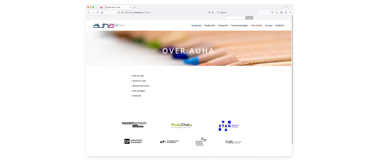
Example: Antwerp University Association (AUHA)
2.3.2. Powered by UAntwerp
External partners and collaborations are very important for a university. They give us oxygen, help us reflect and are also important for fundraising.
Our university is constantly looking for different forms of partnerships with businesses, industry, as well as civil society. Sometimes such collaborations need a new entity, which is very closely linked to the university, yet stands on its own. There is a clear link with the university, but the independence of the project prevails. The need for an own logo is essential, making a subsidiary formula too restrictive, but the link with the university must also be visually visible.
Powered By logos are currently provided for three domains:
- Valorisation domains: UAntwerp is pushing hard for collaborations with businesses and has developed three valorisation domains. The ‘Blue App’ and ‘Vaccinopolis’ domains are entities in and of themselves, but are located entirely within the UAntwerp environment. Because of the independence of the projects and the close cooperation with businesses, a Powered By logo is provided. Projects within Vaccinopolis and Blue App will not receive their own logo, as an overarching Powered By logo is provided. The domain ‘the Beacon’ is a non-profit organisation in which UAntwerp participates. For this reason, there is no Powered By logo for The Beacon. If new initiatives are developed within the valorisation domains, RIVA and ADMCOM will consider whether a Powered By logo should be created.
- Spin-offs: Spin-offs set up entirely within UAntwerp are a major exception. Currently, there is only a logo provided for ‘Football college’. If a new spin-off is established that meets this criteria, RIVA and ADMCOM will consult on developing the Powered By logo.
- Non-profit organisations: UAntwerp provides financial support to the non-profit organisations USOS and USAB. The Powered By logo is provided for them. Both the entity's logo and the UAntwerp logo are brought together in one logo. Both logos have their own identity, but they clearly indicate that they are from the same family. The shape, font and colour of the parent logo is used, but a new logo is formed.
Logo composition
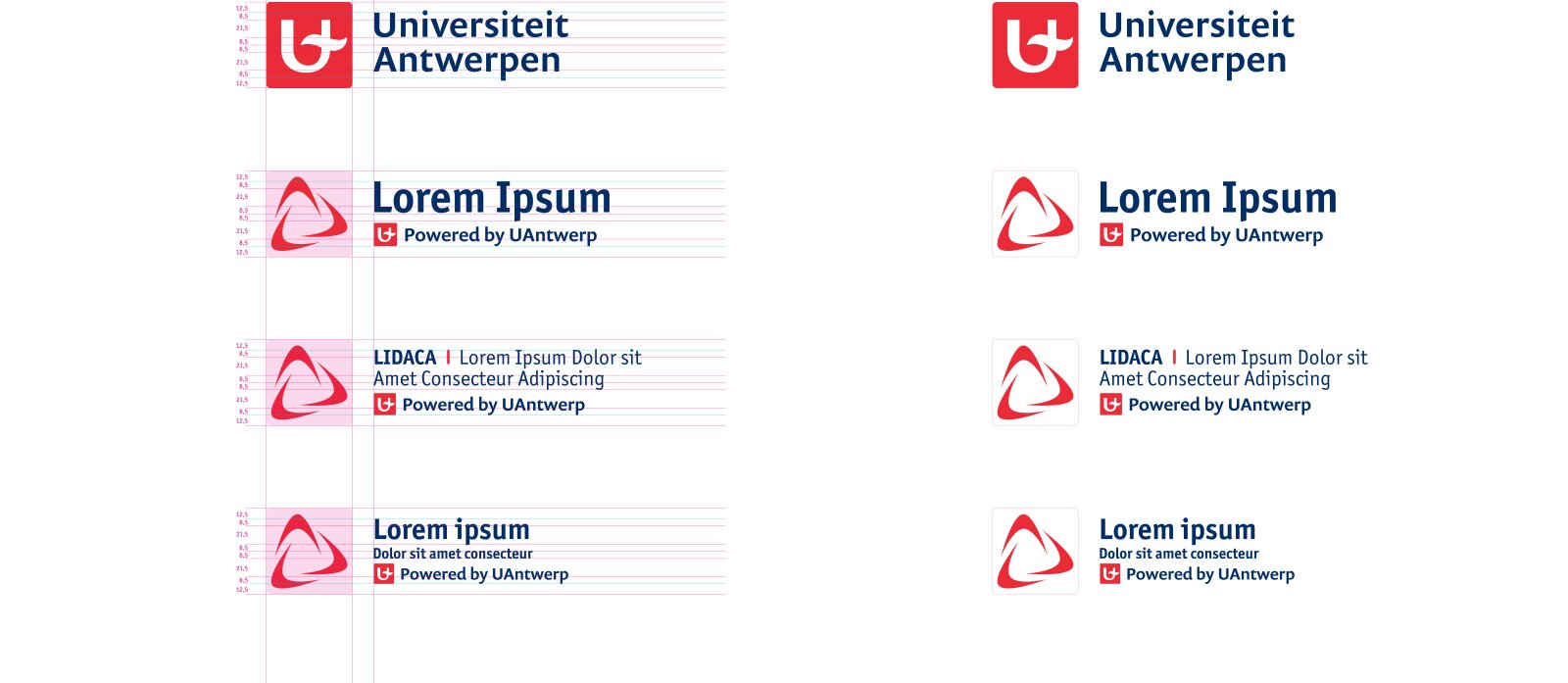
The Powered By logo was developed to fit perfectly into UAntwerp's existing house style. It matches the style (use of colours, fonts, etc.) amd it also has the shape of the parent logo, which makes it easy to combine it with existing templates and page layout, following the same guidelines as the parent logo.
When developing the additional label, there are some restrictions to take into account:
- Use at least 1 main colour from the UAntwerp palette.
- The colours must match the UAntwerp colours.
- The logo is inseparable: the text cannot be used without the image and vice versa.


