An important part of any house style is the page layout, where the logo, colours, typography and basic shapes all come together. If we want to convey our impact and quality, then above all else, the message must be intuitive and easy to read. This requires a pleasing and logical page layout, in line with people's natural reading behaviour. When reading both online and offline content, we tend to follow the shape of the letter F:
- from left to right
- and from top to bottom.
This means that the most important elements of the message are at the top left and bottom left. This leaves room for a compelling image, wherever appropriate. The ideal UAntwerp page layout can therefore be defined as follows:
- left-aligned
- main message or title at the top left, in large font
- clarification or subtitle below this, in medium font
- optional body copy in small font
- logo at the bottom left
- everything in a white frame with properly proportioned rounded corners

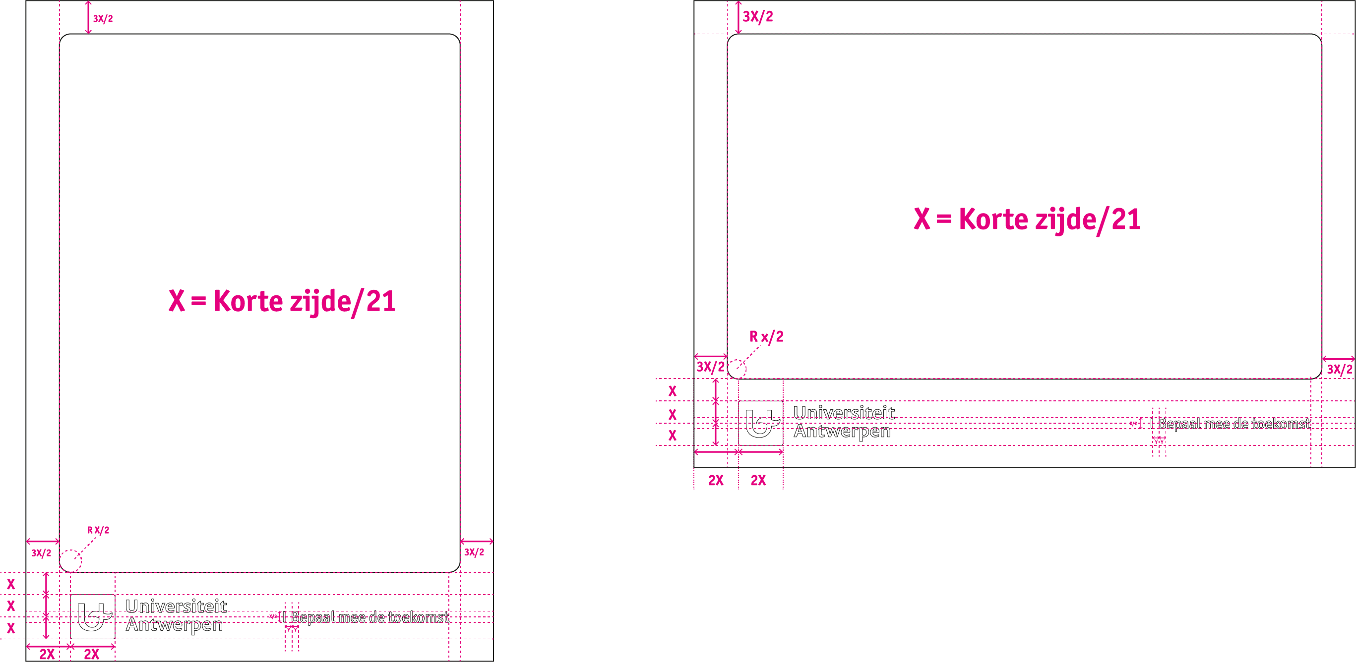
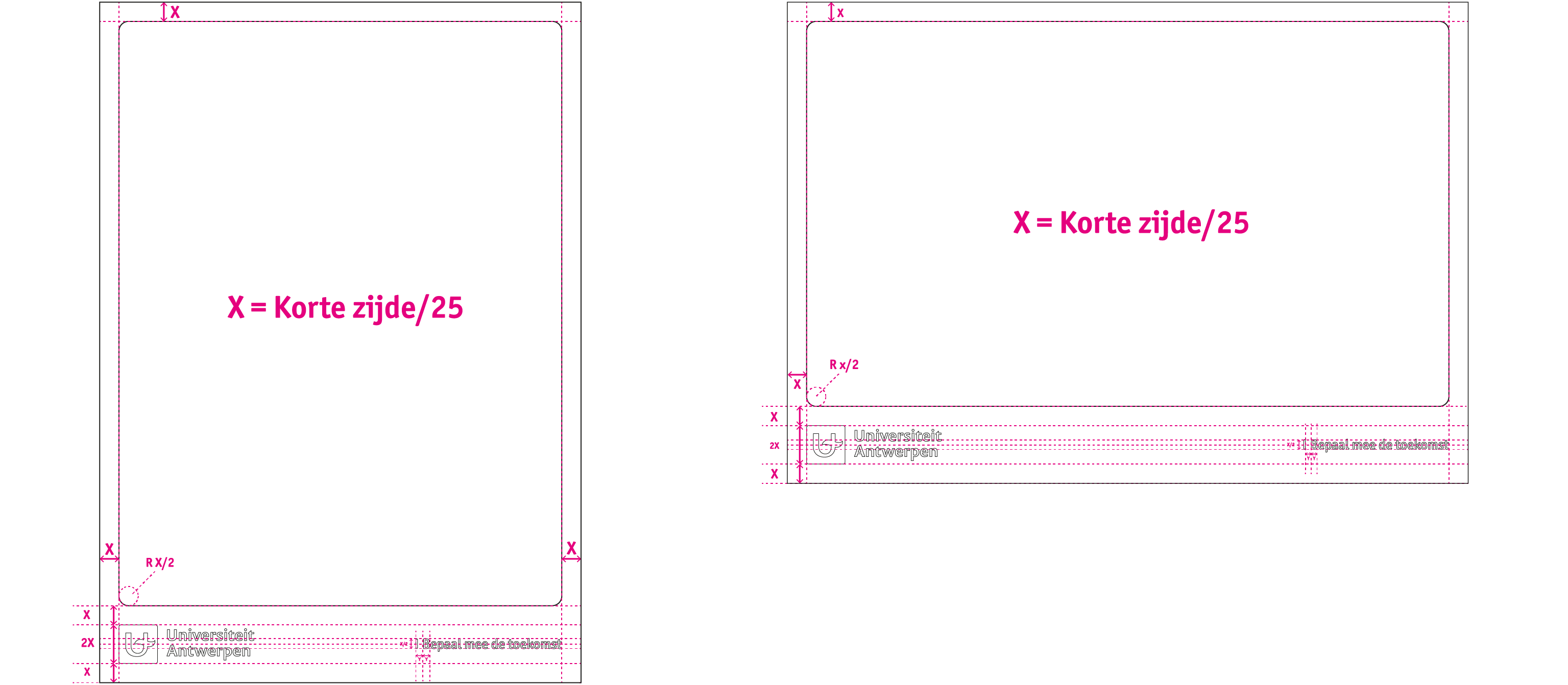
There are two versions of the page layout. The differences are the margins and the size of the logo. Both page layouts are built according to a fixed formula. In the first version, we take the length of the short side of our format and divide that by 25. The resulting value indicates the ratio of the margins and logo. In the second version, we divide the length of the short side by 21.
Page layout with small margins
Page layout with wide margins