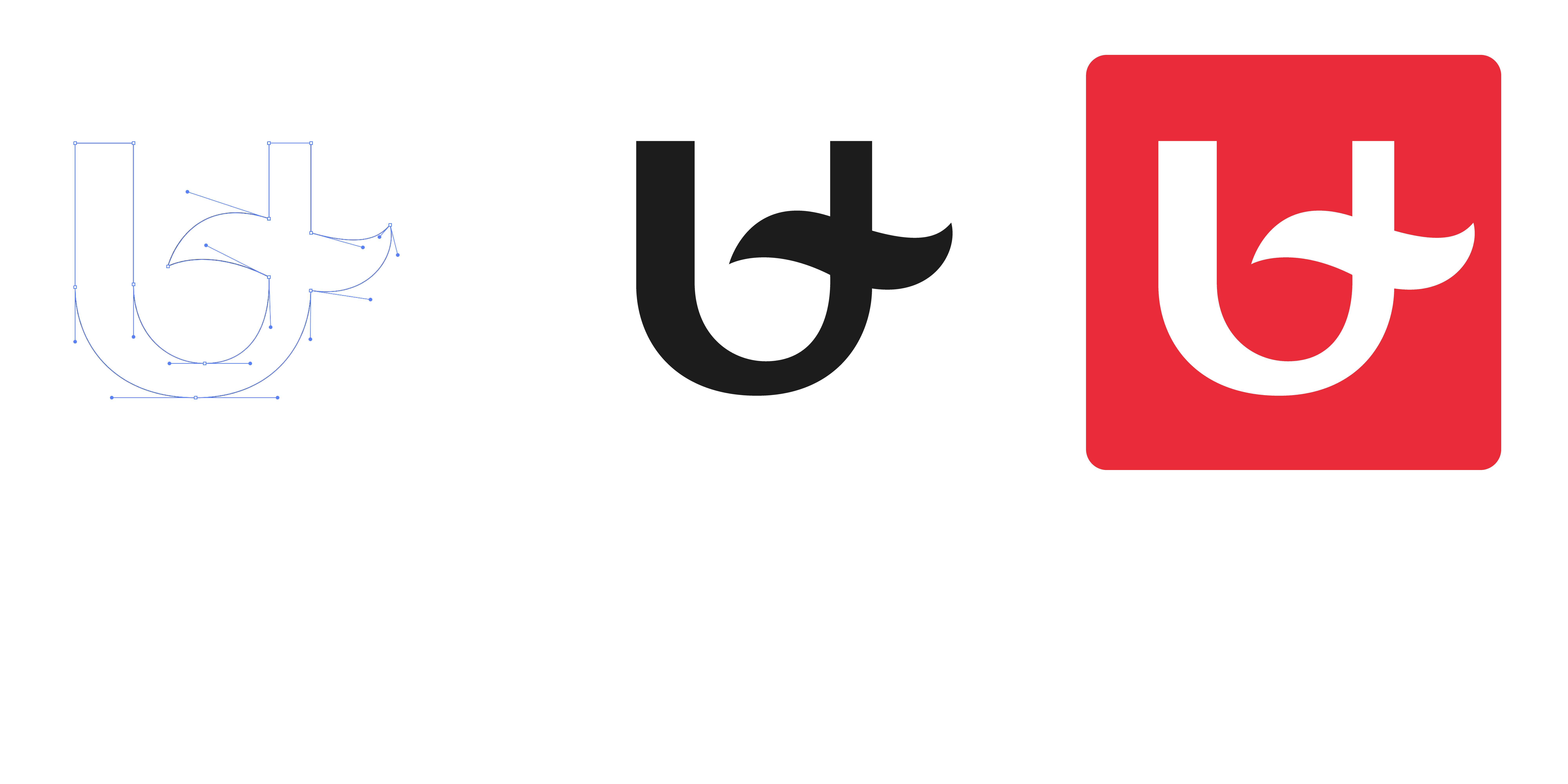
The basis of our logo is the ‘U’ we claim as a university. This ‘U’ is crossed by a wave representing the Scheldt, as our university is located right in the centre of Antwerp, which lies on the banks of the river. The city is a centre of challenges, big and small, and the university senses those problems, studies them, and looks for solutions. We are a lab in the city.
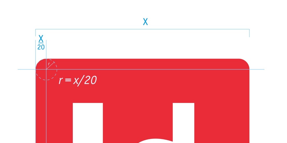
The ‘U’ is in a red square with rounded corners. The rounding is based on the width of the square.
r = X/20 in which r is the radius of the circle of the rounding and X is the width of the logo
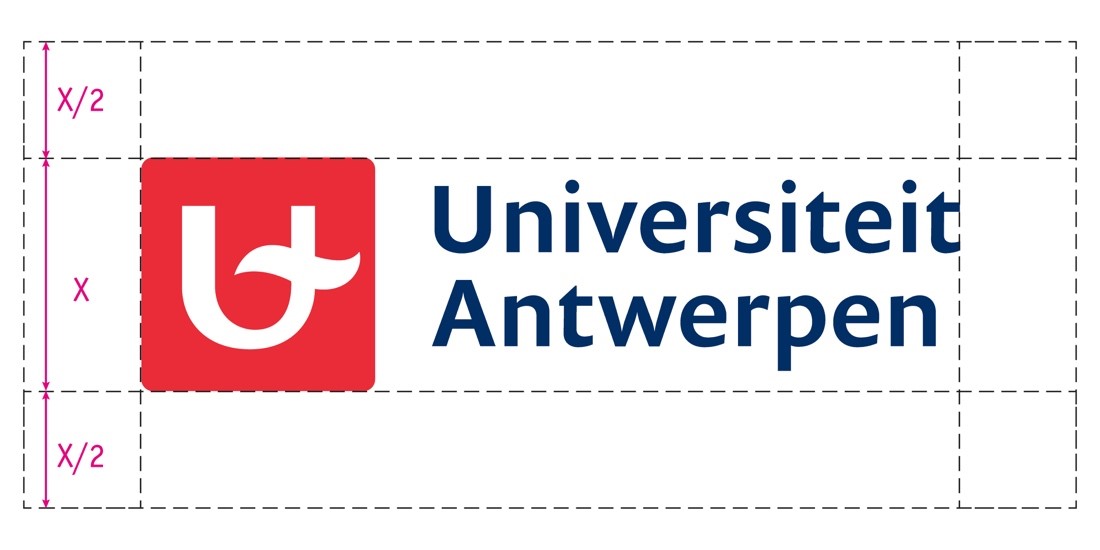
UAntwerp's main logo is always composed of the base square and text. We always use the horizontal version. All other versions (centred or only the base square) are exceptions. The font of the text is Prenton Medium, the basic colours of the logo are UAntwerp red and UAntwerp blue.
Please note that the square with the ‘U’ should not be used separately from the text. These two elements are inextricably linked.

Always provide enough white space around the logo: half its height defines the bounding box (the mandatory minimum of white space around the logo).
Variations of the main logo
1. Sponsor logo
We use this logo when UAntwerp sponsors an event organised by an external partner (e.g. Dag van de Wetenschap).

2. Monochrome partner logo
We use this logo when UAntwerp organises an event together with an (equal) partner, such as the AUHA association. The colour can be adapted to the other partners' logos, but the logo remains monochrome (no gradients).


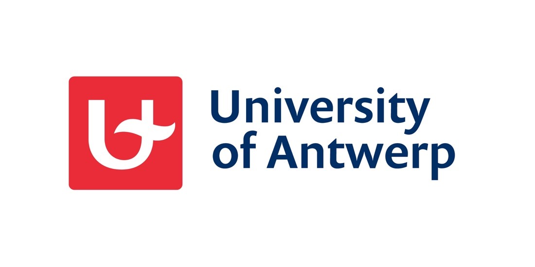
3. The English logo
We use the English logo in non-Dutch communication. When communication is both in Dutch and English, we use the Dutch logo. Never use the two logos together.
4. Vertical logo and other versions
The horizontal logo is the standard logo. All other versions are exceptions. Please contact communicatie@uantwerpen.be if you'd like to use one of the versions below.


